Ask any professional stock and cryptocurrency day trader what their most powerful weapon is, and they will often respond with a short answer: candlesticks.
The most common method of plotting price patterns is candlestick charting. In the 1700s, Monehisa Homma, a Japanese rice merchant, invented them. This was 100 years before the West created the point-and-figure and bar charts. Homma found that rice prices were not only determined by supply and demand but also by traders’ emotions. Charles Dow, one of the founder fathers of technical analyses, was able to refine Homma’s graph over the years.
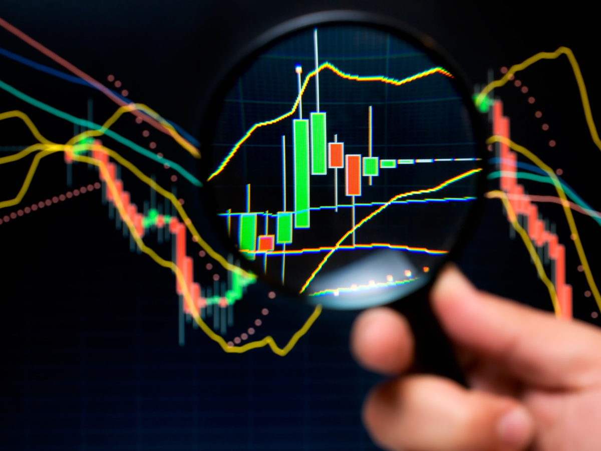
Candlestick charts are named for their appearance. They can be used by investors and traders to make trading decisions based on historical market data. This may provide some lessons from the past such as important price resistance levels and support levels to be aware of and any potential impact they might have.
The candles are visual representations of traders’ emotions. They can be colored differently depending on how large the price movement is. A candlestick chart is a crucial skill for novice traders. Although they can be intimidating at first, this guide will help you understand the meaning of each element and how to interpret them to maximize your use of historical price data.
It is important to understand when trading. To be able to quickly identify patterns created by Japanese candles and respond to them, it is best to trade within a 1-hour time frame.
How do candlestick charts work?
To create each candlestick, you will need the following data sets/price points:

- Open: The first trade price for a specific asset recorded within a given time period.
- High: The highest trading price for the asset in the given time period.
- Low: is the lowest trading price for the asset in the specified timeframe.
- Close: The last time the asset was traded within this timeframe.
These data sets are commonly referred to collectively as the OHL values. Their relationship determines the appearance and function of the candlestick.
The distance from the close and open price points is known as the body or. While the distance between the body and high and low prices is called the shadow. This range is calculated by subtracting the highest from the lowest price point.
Bar charts have a disadvantage over candlestick charts because they are less visual. Bar charts can be difficult to see which direction the price is moving, while candlestick charts are easier to understand.
How to read candlestick charts?
Candlestick charts are easy to read because they present a simple overview of price history. The graph shows one candlestick representing the same time period, which could be any length of time from seconds to decades.
In general, the longer the candlestick’s body, the more intense the fight between bulls and bears during that timeframe. A wick that is too short means that the high or low closing price was within the time frame. If the candlestick’s body is colored green, it indicates that the asset closed higher or lower than it opened. It will also indicate that it was close to the closing price during the measured time frame. Some charting tools may use black and/or white instead of red or green. Hollow candlesticks represent up movements, while solid candlesticks represent down.
Different types of candlestick charts
You can divide candlestick charts into single, double, and triple patterns. Each pattern represents different market trends.
Single Candlestick Patterns
This pattern is the foundation of the others. You can learn to recognize market trends by understanding single patterns, as well as double and triple patterns. There are eight basic single candlestick designs:
- Doji: In Japanese, “Doji” refers to “the same as”. It is when the closing and opening prices within a given time period are the same or nearly identical. The candle’s body will shrink and the tail will become prominent.
- Gravestone: This stone resembles a gravestone. It represents bearish conditions. There will be a long, wicked ring above the body.
- Inverted Gravestone/dragonfly: The tail is below the body, which indicates that the bullish potential is decreasing.
- The hammer/hanging guy: A very long wick is found below the body, with a very small upper wick. The end of a bullish, or bearish force is indicated by the hammer. A “hanging man” is the symbol for a bullish force.
- Inverted hammer/Shooting Star: This symbolizes a trend in the opposite direction and is represented by a longer upper wick and a smaller body. It’s also known as a “shooting star” when it signals a change in a bearish market. The opposite is an “Inverted Hammer”.
- Spinning top: This pattern is formed when there has been very little movement in the market. It is represented by a shorter body and wicks on both sides that are nearly identical in length.
- Standard line: This pattern features candles with very long tails at both ends and long bodies. This pattern does not give any market cues but rather indicates that the market has sustaining power regardless of which direction it is heading – bullish or bearish.
- Marubozu Pattern: This pattern has a body without tails. This indicates the development of a bullish, or bearish atmosphere.
Double Candlestick Patterns
These candlestick patterns can be read in pairs. These are the most popular double candlestick patterns:
- Bullish/bearish engulfing: Engulfing patterns that signal a market reversal and show that one trend is being outpowered by another in the opposite direction. This trend is displayed by two candles adjacent to each other, which indicates whether bullish or bearish movements are dominant – a bullish pattern with an engulfing pattern will have one bearish candle followed closely by a larger bullish candle.
- Tweezers: This pattern can also signify a change in market conditions. Both candles will have the exact same wick length and body, but tweezers may be at the top (wicks under) or at the bottom (wicks at the top). Tweezers at either the bottom signal a change from bearish to bullish and vice versa.
Triple Candlestick Patterns
These patterns are made up of three candles, as the name implies. The trend reversal patterns of the three most important triple candlesticks are:
Morning/evening star: The evening star pattern begins with a bullish candle. Next, there is a smaller bullish/bearish star. Finally, there’s a longer bearish candle which is longer than the first one in the set.
This pattern has three soldiers. It is a staircase that has three steps. The pattern becomes increasingly larger for a bullish trend when the first candle is smaller and the second candle is smaller. This indicates that the trend has changed from a bearish to a bullish one.
What are Heikin-Ashi Candlestick charts?
We have already discussed Japanese candlestick charts. What are they? How do you read them? The Heikin-Ashi method is another way to calculate candlesticks. These types of charts are based on average price data. Heikin-Ashi is able to identify market trends and price patterns and potential reversals, unlike traditional Japanese candlestick charts that don’t provide details about the market open and closing.
To get a better overall view of the markets, traders often use Heikin-Ashi and traditional Japanese candlestick charts.
Green Heikin Ashin candles without an upper wick usually indicate a strong upward trend, while red candles that lack an upper wick often indicate a strong downtrend. This technique of price charting uses average prices data so patterns may take longer to form. These charts don’t show any price gaps.
Last Thoughts
Japanese candlesticks can be used to analyze past and present price movements in the timeframe you choose. It’s essential to do some fundamental analysis and to look at financial, political and economic trends that could impact the performance of the asset being analyzed.
It would be foolish to expect a cryptocurrency to go up in value because of an upcoming promotional event or airdrop. A measured approach to day trading, using techniques such as dollar cost averaging (DCA), where you buy at certain intervals, can make all the difference in a month or a year.
Ask yourself this question: Would you prefer to earn $10,000 more trading or to save $10,000 by eliminating bad trades for the year? Surprisingly both have the same effect on your bottom line.
Let’s take a look at the Land of the Rising Sun to illustrate the point further. You’re likely to be familiar with Japanese martial arts such as karate or aikido. They’ll tell you that defense is just as important as attack. This is what you should remember next time that you sit down in front of your computer to start drawing lines on those candlesticks.


")